
Let's Discuss: Skeuomorphism

One of the first websites I built was, hmmm…. Let’s call it “tactile.” Yes, let’s avoid words like “ugly” and “cluttered.” The website had folders — yes, actual images of folders, with folder tabs that would navigate to other folder covers when clicked upon — stick-it notes, scribbly pencil fonts and, strangely, a wooden sign with a spray paint font. “Tactile” was in vogue back then, or so I tell myself. I shudder at that website now. Sure, I understood how the navigation worked. I understood where the important information was. But to anyone else? Time and distance has helped me understand all that “tactile” cleverness was just confusing.
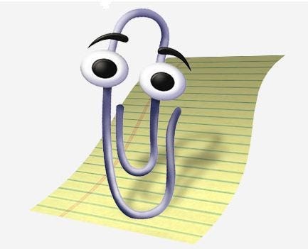
One of our lectures has informed me that this is an example of metaphoric design. More specifically, skeuomorphism. Skeuomorphism is “the design concept of making items resemble their real-world counterparts.” The reason skeuomorphism came about isn’t difficult to understand. When society started shifting its work medium to digital, designers used metaphors of everyday objects so that average Joe could intuitively understand how to process information, and how to navigate it. Remember the paperclip helper? … because paperclips are… helpful….?
From our lecture:
[But Skeuomorphism] leaves a lot to be desired: namely being restricted by clumsy, dated and non-scaling depictions of three dimensional industrial objects.
Dated. Clumsy. Non-scaling. And, as I said earlier, cluttered.
So is skeuomorphism all bad?
Then I found this article, which says skeuomorphism is a good thing. It says instead of all my folders and stick-it notes and scribbly font being clutter… they’re more like clues. When they’re used right, that is, which I decidedly was not doing with that “tactile” website. And what’s another word for “clues”? Affordances!
When I first heard the lecture, I was ready to condemn skeuomorphism as antiquated and prone to misuse. The latter, I still might be right about. But this article has me waxing nostalgic about it again.
What if skeuomorphism isn’t some outdated trend? What if instead of throwing the baby out with the bathwater, we can learn from our mistakes? Well-used skeuomorphism can be another tool in an interactive designer’s toolbox.
[Skeuomorphism is] like a spectrum, or a color palette, that designers have at their disposal. At one end, we have gross misuse: Fake wood, fake leather, fake shadows. At the other, we have thoughtful use of perceived affordances: A digital clock face that looks a lot like a normal watch, because it’s easier to read.
Good interactive design should assume that users are smart enough to know how to navigate a web page without literal folder tabs. But, it should also know how to tastefully evoke these metaphors to good effect.