In: Appointment Scanner
Scans for Global Entry, SENTRI, NEXUS appointments
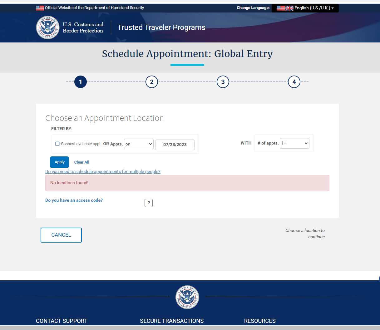
This week I started the process of renewing my Global Entry. I knew finding appointments would be difficult, but the UI certainly wasn’t helping.
Out:
I just needed an appointment before the end of 2023. Being forced into the “Soonest available appointment” or being forced to pick a specific “by” or “on” date — confusing. Just show me everything you have.
I wasn’t sure what “# of appointments” meant — I just wanted 1, yet I wanted to see the maximum amount of options. The 2+, 3+, etc, options didn’t make sense to me. If these are for users looking for appointment clusters, why not more clearly label that? If I’m the biggest use case (and I’m guessing I might be), make this an opt-in option.
After all of this deliberating, I learn there aren’t any appointments available anyway.
I took to Google to figure out how to find an appointment, and I discovered Appointment Scanner.
For $30, Appointment Scanner would scan the available appointments and send me an alert when one was available.
The UI makes a lot more sense.
In:
Choosing the days of the week I want. I think of my near-future in terms of days available, not dates available.
A date range indicator that makes more sense.
A clear explanation that I’m not going to be charged monthly. I love a company that avoids that Dark UX pattern.
Multiple options for receiving alerts (browser, email, text).
And now I’ve got my appointment for next Friday.
That’s good UX! I wish Global Entry (et all) would start incorporating features like this. Why not make the UI more clear? Why not let me set alerts when appointments become available?


